
Civilization VII's Deluxe Edition launched just yesterday, and the internet is already buzzing about its UI and other issues. But is the UI truly that bad? Let's delve into the game's interface elements and see if the online criticism is justified.
← Return to Sid Meier's Civilization VII main article
Is Civ 7's UI as Bad as They Say?
Early access players of the Deluxe and Founder’s Editions have already voiced concerns about Civilization VII, particularly regarding its user interface (and other missing quality-of-life features). Before joining the chorus of complaints, let's objectively analyze whether the UI truly deserves the harsh criticism. We'll dissect its components and evaluate if it meets the standards of a functional, if not excellent, 4X interface.
What Makes a Good 4X UI?
Defining an "objectively good" 4X UI is tricky. The ideal design depends heavily on the game's style, goals, and context. However, UI/UX experts have identified common elements found in successful 4X interfaces. Let's use these principles to assess Civ VII's UI.
Clear Information Hierarchy
A clear information hierarchy prioritizes accessibility and importance. Frequently used resources and mechanics should be readily visible, while less critical features should be easily accessible with minimal clicks. A good UI doesn't display everything at once; it organizes information logically.
Against the Storm offers a great example. Its building info menus, accessed via right-click, use tabs to organize information by frequency of use. Essential actions are prominent, while less frequent functions are tucked away in subsequent tabs.
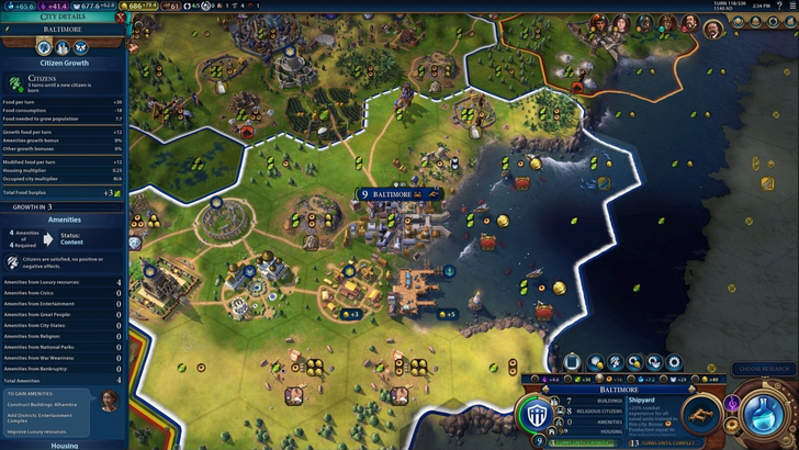
Let's examine Civ VII's resource summary UI. It effectively displays resource allocation across the empire, separating income, yields, and expenses via dropdown menus. The tabular format facilitates easy tracking, with detailed breakdowns available. The menu's collapsible nature is a plus.
However, it lacks granular detail. While overall resource production from Rural Districts is shown, the specific district or hex isn't identified. Expense breakdowns are also limited, omitting various costs. While functional, improved specificity would significantly enhance usability.
Effective and Efficient Visual Indicators
Effective visual indicators—icons, colors, overlays—convey information quickly and intuitively, minimizing reliance on text. A well-designed UI uses visuals to communicate crucial data efficiently.
Stellaris, despite its cluttered UI, uses visual indicators effectively in its Outliner. At a glance, players understand the status of their survey ships. Icons clearly indicate colony needs, reducing the need for excessive clicking.
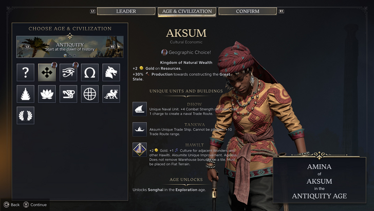
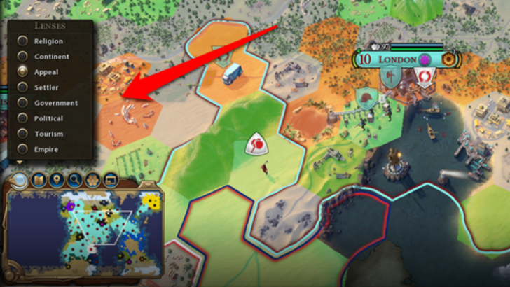
Civ VII relies on iconography and numerical data, but incorporates some effective visual indicators. The tile yield overlay, settlement overlay, and settlement expansion screen effectively highlight resource availability, city-founding viability, and development suitability.
The main criticism here centers on the absence of certain lenses present in Civ VI. However, many of these missing lenses relate to Civ VI-specific features (appeal, tourism, loyalty). The lack of customizable map pins is also a point of contention. While not disastrous, there's room for improvement.
Searching, Filtering, and Sorting Options
As complexity increases, search, filtering, and sorting options become crucial. These features—search bars, filters, sort buttons—streamline navigation and reduce frustration.
Civ VI's robust search function is a prime example. Players can easily locate resources, units, or terrain features on the map. Its Civilopedia links directly to in-game elements, facilitating seamless navigation.
Civ VII lacks this crucial search function, a major drawback noted by many players. Given the game's scale, this omission significantly impacts usability. Hopefully, Firaxis will address this in future updates.
Design and Visual Consistency
The UI's aesthetic and cohesiveness are vital. A poorly designed UI detracts from the overall experience, regardless of gameplay quality.
Civ VI's dynamic, cartographic style is visually appealing and cohesive. Its aesthetic reinforces the game's identity.
Civ VII adopts a minimalist, sleek design, prioritizing refinement over vibrancy. The restrained color palette and simplified iconography align with its aesthetic. However, this more subtle approach has resulted in mixed reactions, with some players finding it less engaging than Civ VI's vibrant style. This is ultimately subjective.
The Verdict: Not as Bad as Advertised
While Civ VII's UI isn't perfect, it's not as flawed as widely claimed. The missing search function is a significant shortcoming, but not game-breaking. Compared to other issues, the UI's flaws seem relatively minor. While it lacks the visual flair of some competitors, it possesses strengths that shouldn't be overlooked. With updates and player feedback, it has the potential to significantly improve. Currently, the criticism seems overly harsh.
← Return to Sid Meier's Civilization VII main article
Sid Meier's Civilization VII Similar Games


![City Devil: Restart [v0.2]](https://img.icssh.com/uploads/38/1719554737667e52b102f12.jpg)